Why
Lucky 7 is a new business that needs a branding, as well as promotional pieces to start advertising with. They want strong designs that attract their market and start them off strong.
About
Lucky 7 is a mobile tattoo shop, they travel to different vendor shows and events. They value confidence and connecting to your highest power. They embody being bold and fierce, not afraid to be themselves. They know it is important to feel confident in yourself and strive to help you do so.
Research
Luck 7 wants to attract a target market who is or wants to feel confident in their body. They want to see their customers being bold and fierce in their bodies. They want their customers to be confident in themselves and show their true colors.
Their colors should represent their bold and fierce values. They want to have a pattern that people recognize just for them. They want their confidence to show through their designs.
Identity
Lucky 7 wanted to incorporate a bold and fierce tone to their designs, showing their confidence through their advertisements. They not only want their customers to feel confident in themselves, but in Lucky 7’s work as well.
Because of this, I chose to use bold reds for their colors. Their logo is bold and funky, showing their fierce and confident tone. I used the same font for all headings as well.

Social Media Posts
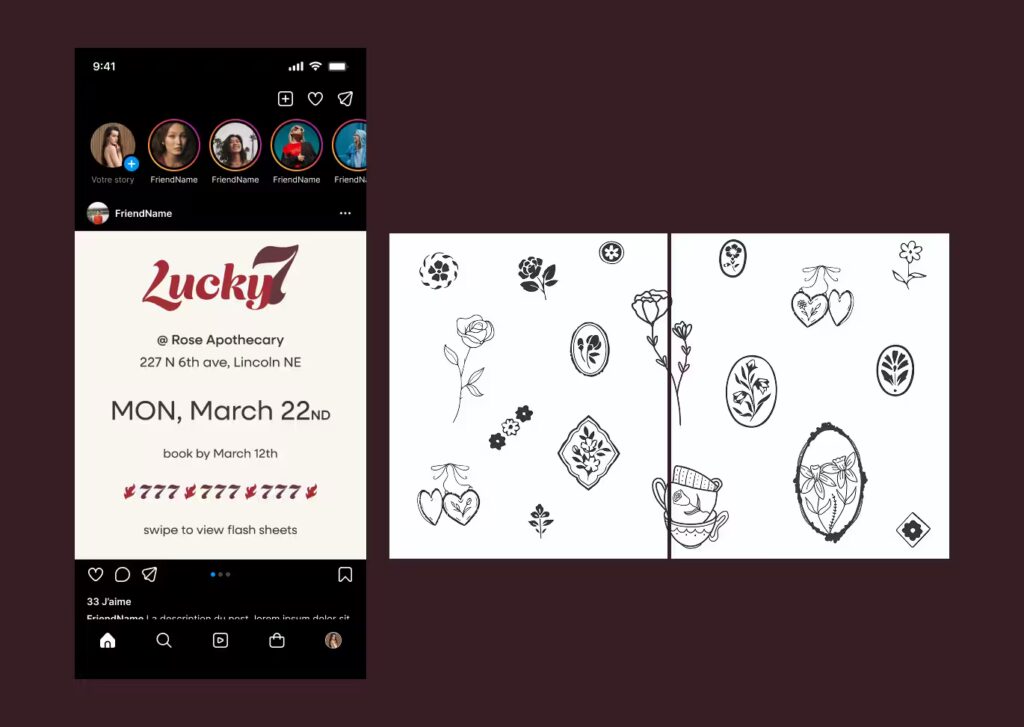
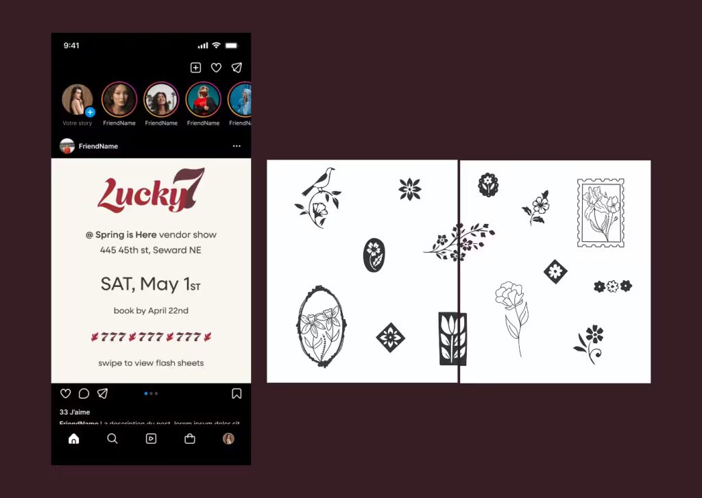
My goal for the social media
post was to incorporate their
bold feel, without it being too much for the eye. I wanted viewers to want to stop scrolling when their eyes see it.
To accomplish my goal, I used their bold colors, as well as their pattern in the design. I incorporated all the information for the show they will be attending as well as flash sheets. This is so the viewer can learn all the information they need in
one place, instead of having to search for it.
Branding Pieces
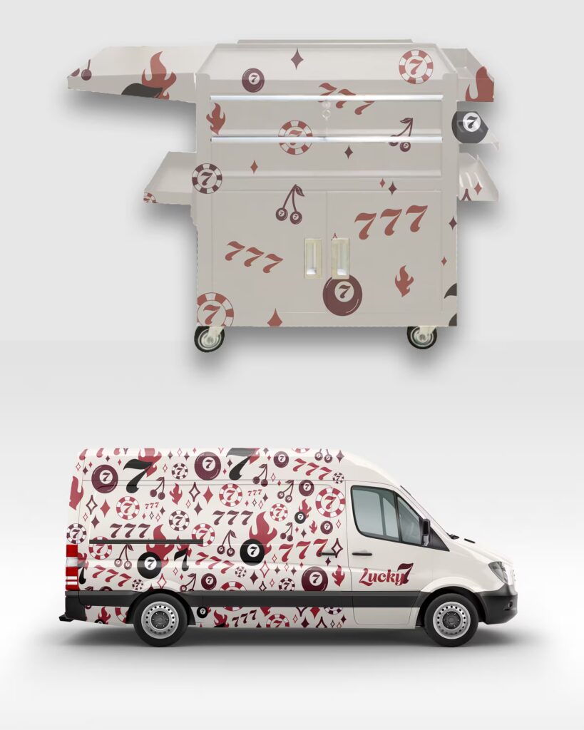
My goal for the branding pieces was to incorporate all of their identity into the designs. I wanted these pieces to embody their brand. These pieces will be used for every show.
For both pieces I wanted to incorporate their pattern. For the van, I incorporated their pattern on most of the van, making it stand out. This is because I wanted to portray the bold and confident tone to the design. For the cart, I made the pattern more subtle since it will be sitting near you while you are getting your tattoo. My goal here was to make it a lot less busy so you wouldn’t get more anxious when getting your tattoo.
Brochures
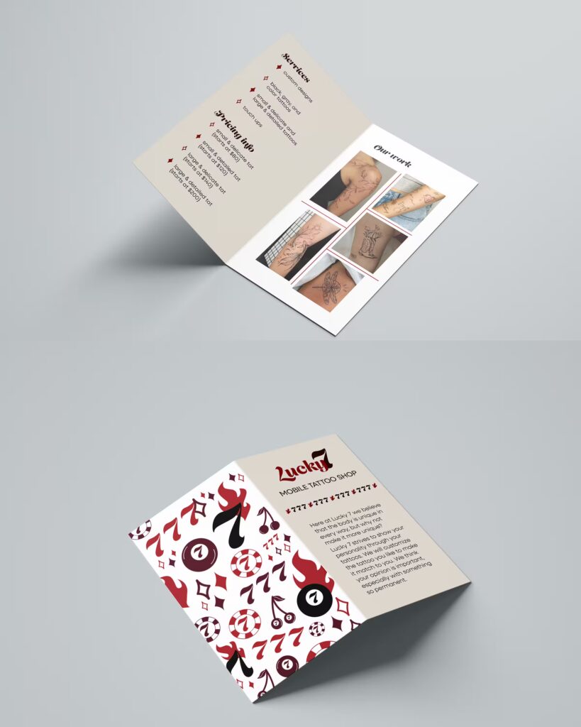
My goal for the brochures was to incorporate their pattern and values. I wanted it to be easily to read with clear information.
To accomplish this, I used their pattern on the back page of the brochures. I used their bold font for the headings. The bullet points are the stars from their pattern, keeping all pages cohesive. I also used their colors on every page.
