Why
Arbor Day would like to rebrand and design new promotional pieces. They want to rebrand because their target audience has changed, as they are wanting to reach more of the younger generation.
About
The Arbor Day Foundation is a global nonprofit dedicated to planting trees. Since 1972, we’ve planted more than half a billion trees in over 60 countries. But the world needs more. And it needs them now. That’s why we’re on a mission to plant our next 500 million by 2027 with a dedicated focus on forests and communities most in need of trees.
Research
Arbor Day would like to target new homeowners, adults that are new to the whole adult life. Their audience is fun and playful, they are never too serious. They like to go with the flow and support their environment. They love nature and get very excited about taking care of the nature around them.
Arbor day values nature, playfulness, and excitement. Their colors should represent nature and the environment around us. They want a hand drawn feel to their designs, connecting to the playfulness feel.
Identity
Arbor Day wanted to incorporate an earthy tone as well as a playfulness vibe. They wanted to connect to their new target audience by making taking care of nature feel fun and rewarding. They want new homeowners to know that planting trees is important and fun.
Because of this, all of their colors represent nature. The designs have a hand drawn feel to them, giving them that playfulness feel.
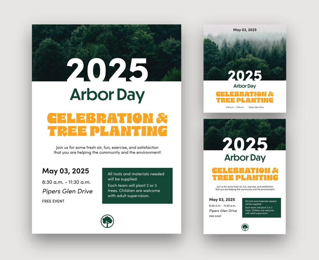
Promotional Pieces
Arbor Day wanted pieces to advertise their upcoming event. My goal was to make the advertisements eye catching while also easy to read.
To accomplish this, I used the bold and funky type for the headline and kept everything else in a sans font, making it easier to read. I made sure there was hierarchy between the different pieces of information.
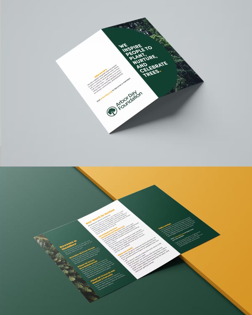
Brochure
For the brochure, I used the funky font as the headlines to keep that playful feel, while also putting it in orange so it stands out and is easy to read on the green background. I incorporated a couple pictures to feel cohesive with the promotional pieces and make it more interesting. The front cover is a half circle, showing a picture of trees behind it to make it more unique.
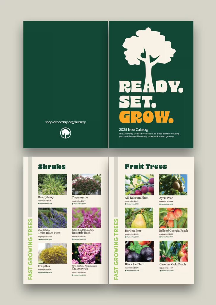
Catalog
On the cover of the catalog I incorporated the same tree that is on the clothing items. This is to make the pieces feel cohesive and keep the playfulness across all designs. I mainly used the greens on this piece, making the orange really stand out when it is used. I set up the catalog pages similar to their website, making the viewers feel familiar when they view the website to learn more.
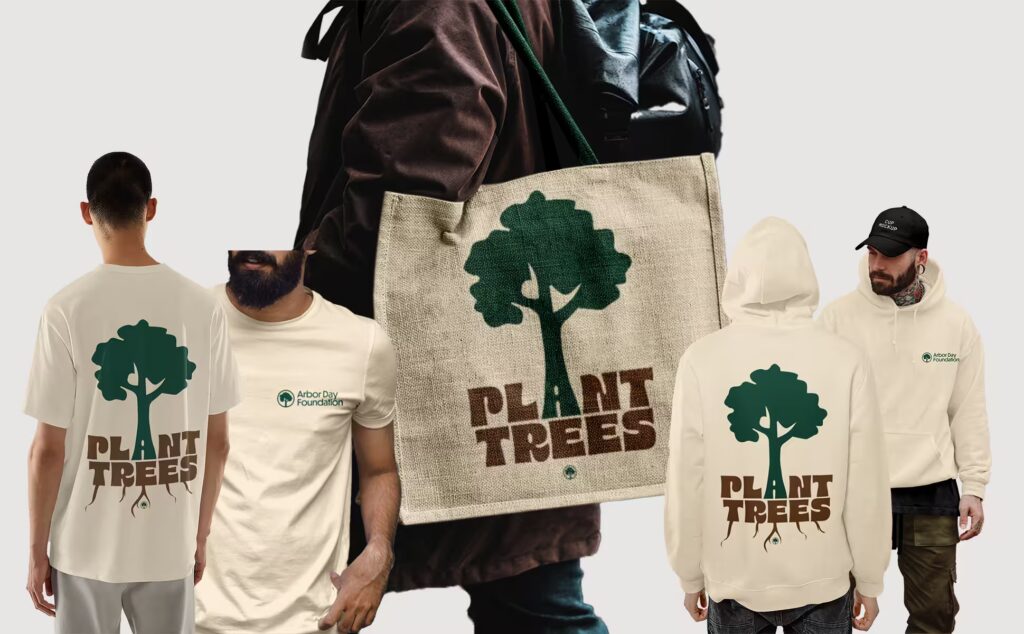
Clothing Pieces
For the clothing pieces I wanted it to have the playful and funky feel while also incorporating part of their logo to keep it cohesive. To accomplish this, I used the bold and funky type for the words and the tree from the logo.
I wanted nature to show through on these pieces so I used their green and brown. I tied the A with the tree to relate it to the words and added roots on some of the pieces to take it even farther and show everything involved with trees.