• Lucky 7

    Why
    Lucky 7 is a new business that needs a branding, as well as promotional pieces to start advertising with. They want strong designs that attract their market and start them off strong.

    About
    Lucky 7 is a mobile tattoo shop, they travel to different vendor shows and events. They value confidence and connecting to your highest power. They embody being bold and fierce, not afraid to be themselves. They know it is important to feel confident in yourself and strive to help you do so.

    Research
    Luck 7 wants to attract a target market who is or wants to feel confident in their body. They want to see their customers being bold and fierce in their bodies. They want their customers to be confident in themselves and show their true colors.
    Their colors should represent their bold and fierce values. They want to have a pattern that people recognize just for them. They want their confidence to show through their designs.
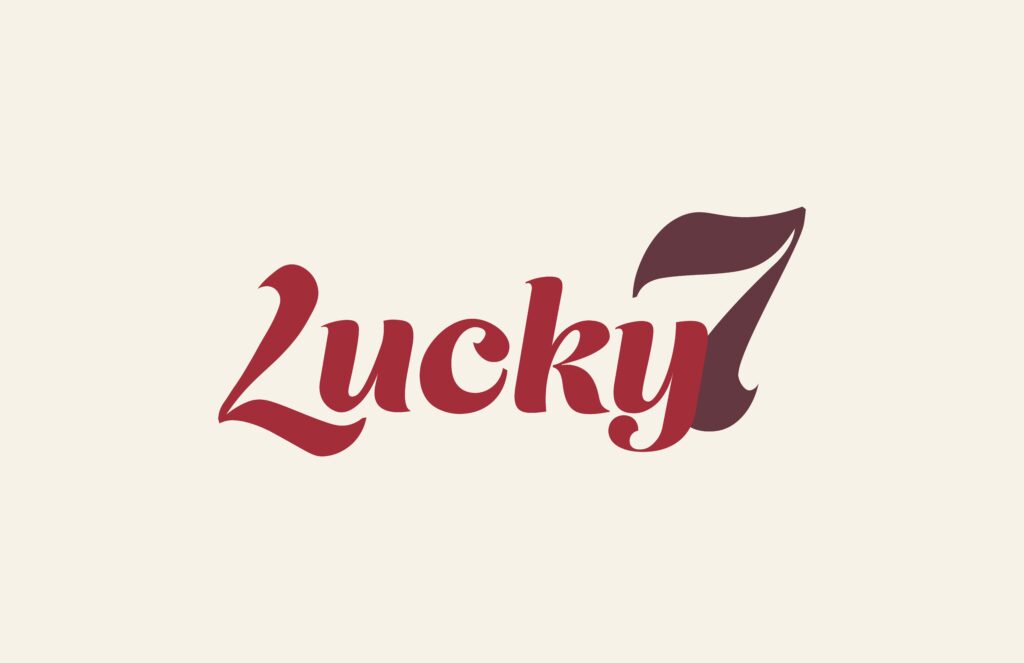
    Identity

    Lucky 7 wanted to incorporate a bold and fierce tone to their designs, showing their confidence through their advertisements. They not only want their customers to feel confident in themselves, but in Lucky 7’s work as well.
    Because of this, I chose to use bold reds for their colors. Their logo is bold and funky, showing their fierce and confident tone. I used the same font for all headings as well.
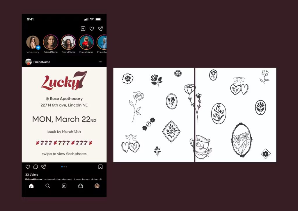
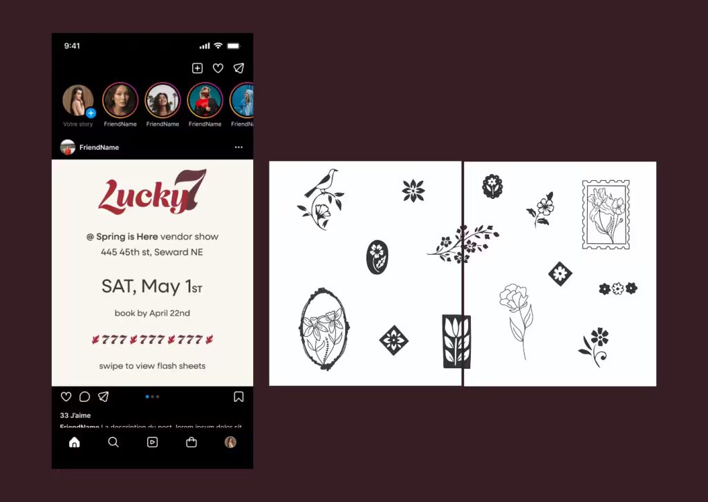
    Social Media Posts

    My goal for the social media
    post was to incorporate their
    bold feel, without it being too much for the eye. I wanted viewers to want to stop scrolling when their eyes see it.
    To accomplish my goal, I used their bold colors, as well as their pattern in the design. I incorporated all the information for the show they will be attending as well as flash sheets. This is so the viewer can learn all the information they need in
    one place, instead of having to search for it.
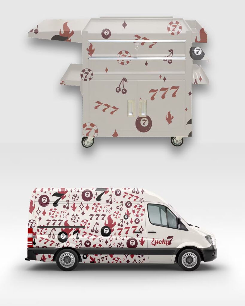
    Branding Pieces

    My goal for the branding pieces was to incorporate all of their identity into the designs. I wanted these pieces to embody their brand. These pieces will be used for every show.
    For both pieces I wanted to incorporate their pattern. For the van, I incorporated their pattern on most of the van, making it stand out. This is because I wanted to portray the bold and confident tone to the design. For the cart, I made the pattern more subtle since it will be sitting near you while you are getting your tattoo. My goal here was to make it a lot less busy so you wouldn’t get more anxious when getting your tattoo.
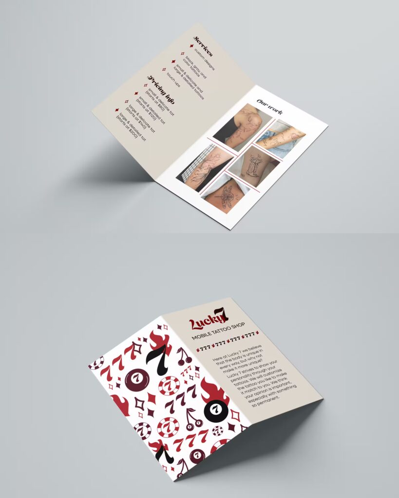
    Brochures

    My goal for the brochures was to incorporate their pattern and values. I wanted it to be easily to read with clear information.
    To accomplish this, I used their pattern on the back page of the brochures. I used their bold font for the headings. The bullet points are the stars from their pattern, keeping all pages cohesive. I also used their colors on every page.

  • Arbor Day

    Why
    Arbor Day would like to rebrand and design new promotional pieces. They want to rebrand because their target audience has changed, as they are wanting to reach more of the younger generation.

    About
    The Arbor Day Foundation is a global nonprofit dedicated to planting trees. Since 1972, we’ve planted more than half a billion trees in over 60 countries. But the world needs more. And it needs them now. That’s why we’re on a mission to plant our next 500 million by 2027 with a dedicated focus on forests and communities most in need of trees.

    Research
    Arbor Day would like to target new homeowners, adults that are new to the whole adult life. Their audience is fun and playful, they are never too serious. They like to go with the flow and support their environment. They love nature and get very excited about taking care of the nature around them.
    Arbor day values nature, playfulness, and excitement. Their colors should represent nature and the environment around us. They want a hand drawn feel to their designs, connecting to the playfulness feel.

    Identity

    Arbor Day wanted to incorporate an earthy tone as well as a playfulness vibe. They wanted to connect to their new target audience by making taking care of nature feel fun and rewarding. They want new homeowners to know that planting trees is important and fun.
    Because of this, all of their colors represent nature. The designs have a hand drawn feel to them, giving them that playfulness feel.

    arbor day logo

    Promotional Pieces

    Arbor Day wanted pieces to advertise their upcoming event. My goal was to make the advertisements eye catching while also easy to read.
    To accomplish this, I used the bold and funky type for the headline and kept everything else in a sans font, making it easier to read. I made sure there was hierarchy between the different pieces of information.

    Brochure

    For the brochure, I used the funky font as the headlines to keep that playful feel, while also putting it in orange so it stands out and is easy to read on the green background. I incorporated a couple pictures to feel cohesive with the promotional pieces and make it more interesting. The front cover is a half circle, showing a picture of trees behind it to make it more unique.

    Catalog

    On the cover of the catalog I incorporated the same tree that is on the clothing items. This is to make the pieces feel cohesive and keep the playfulness across all designs. I mainly used the greens on this piece, making the orange really stand out when it is used. I set up the catalog pages similar to their website, making the viewers feel familiar when they view the website to learn more.

    Clothing Pieces

    For the clothing pieces I wanted it to have the playful and funky feel while also incorporating part of their logo to keep it cohesive. To accomplish this, I used the bold and funky type for the words and the tree from the logo.
    I wanted nature to show through on these pieces so I used their green and brown. I tied the A with the tree to relate it to the words and added roots on some of the pieces to take it even farther and show everything involved with trees.